

Recent Files
👋 Hey! I’m Reyyan,
a UI/UX designer with a background in healthcare, e-commerce, creating meaningful user experiences through design that is usable, effective and ethical.
B2B / B2C
SaaS
+ 4 years of experience
Projects | UI/UX and Product Design
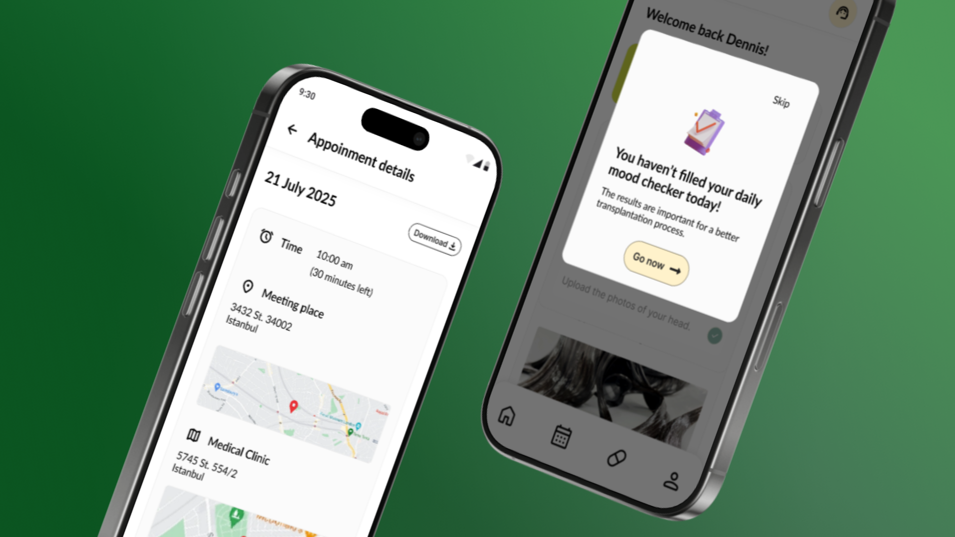
Re-structuring the medical tourism
Medical tourism is becoming increasingly popular around the world, yet there is no structured system for tracking patients before and after their procedure. This case study covers an app designed for patients who travel abroad for hair transplantation.
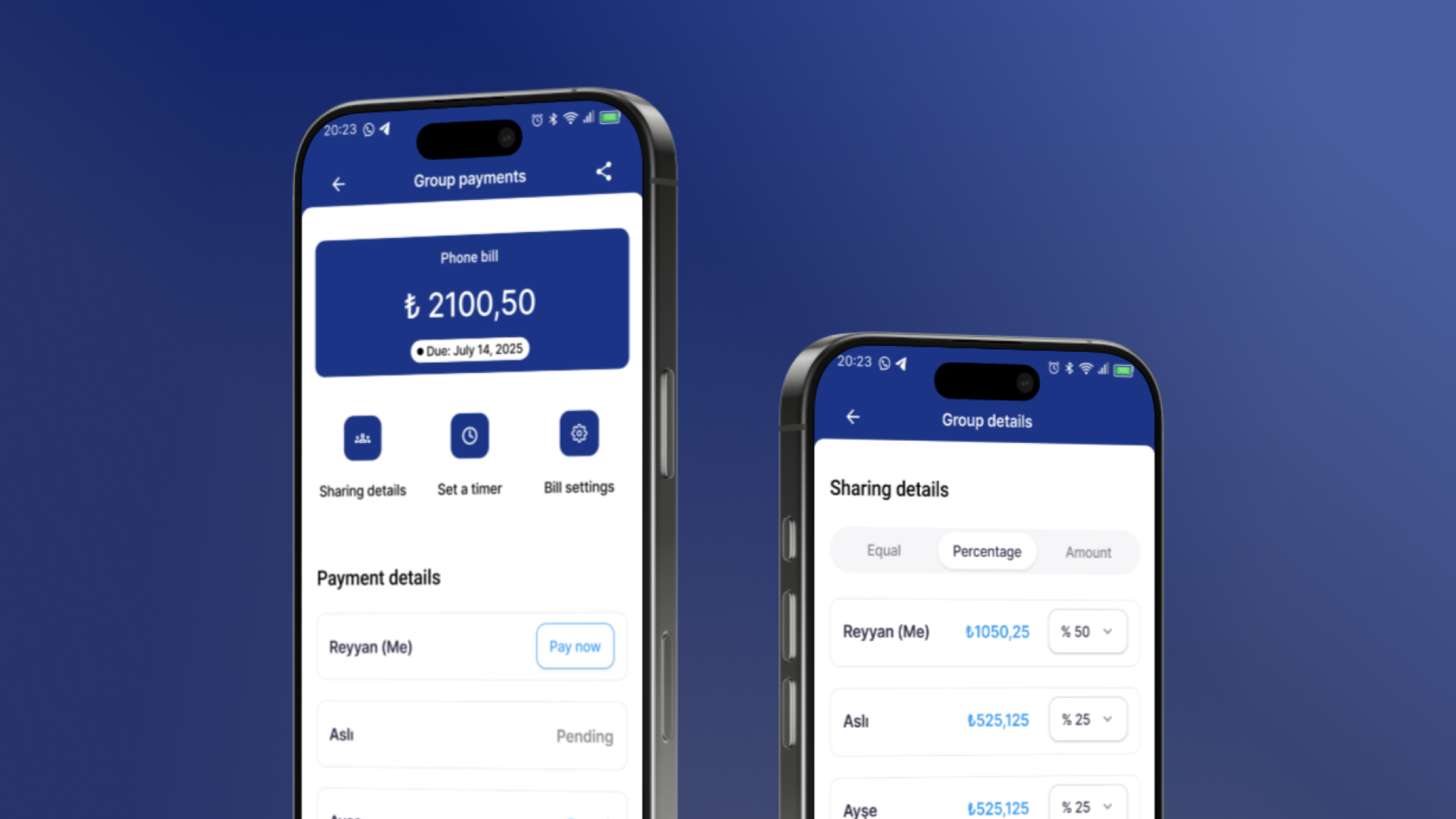
Enabling shared payment | Finance & Banking
This case study only covers the shared payment flow. Starting from group creation and management, the flow allows people who live together to share expenses fairly.
About me
Past Experiences
Freelance Designer
2025 - Present
I offer freelance services on different platforms. My service includes UI/UX design, responsive screen designs, wireframing, prototyping, Webflow web design and such.
Codana GmbH - Software Agency
UX/UI Designer
2022 - 2024
I specialized in user-friendly interfaces for both web and mobile applications. Also, my role extended to usability testing and close collaboration with development teams, providing detailed design specifications and assets.
Actimi GmbH - Telecare and Health
Design Intern
2022 Feb - July
I had the opportunity to collaborate with senior designers, gaining valuable hands-on experience in the field. This role also encouraged me to elevate the overall visual appeal of the projects.
Education
M.A. Fine Arts | Design Culture
Ankara Hacı Bayram Veli University
2023 - 2026
Thesis on Testing User Experience on E-HealthRelated coursework: Interactive Design Culture, Branding and Advertisement Design, Basic Approaches in Design
Erasmus+ Mobility
Jan Evangelista Purkyně University
2024 - 2025 | Full semester
Joined workshops: dark room techniques, traditional paper printing, professional photography, ceramic making, t-shirtprinting.
Worked on installations and many art projects.Related coursework: Visual Communication, Special Photo Technologies, History of Modern and ContemporaryCentral European Arts, Graphics, Drawing
B.A. | English Language and Literature
Akdeniz University
2018 - 2022
Translated and localized various texts into Turkish. Wrote several essays about my interpretations on text materials.Gave presentations, individually or in a group.Related coursework: Children's Literature, Translation and Interpretation, Academic Writing, Applied Linguistics,Mythology, Survey of English Literature
Skills
User testing, UX Research, User Testing, Usability Testing, User Interviews, Agile, User Flows, Data-Driven Design
Figma
Adobe Cloud (Photoshop, Illustrator, After Effect)
Webflow, Wordpress, Framer
Certificates
UI Design Patterns for Successful Software Course by Interaction Design Foundation
Design for the 21st Century with Don Norman Course by Interaction Design Foundation
Transition into UX Healthcare Course by Eric Shumake
Gallery

Re-structuring medical tourism
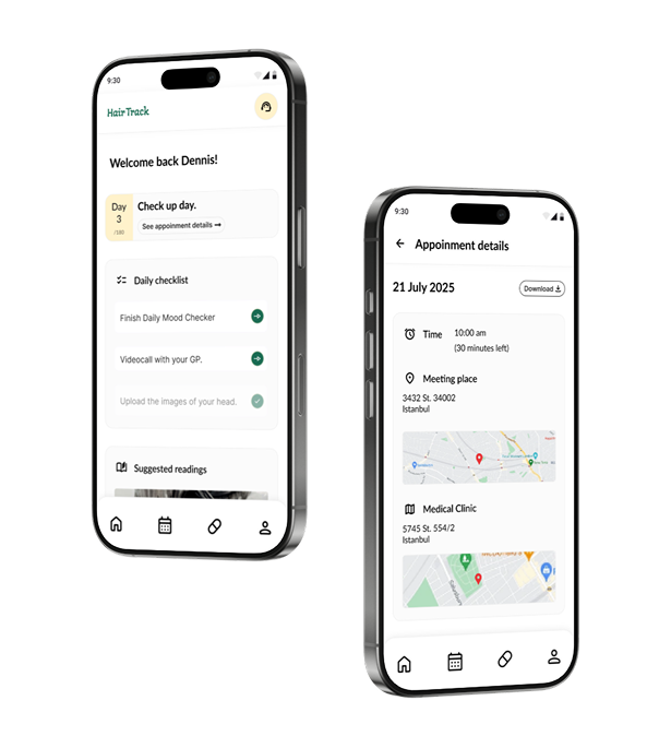
Cosmetic surgery field growing bigger everyday. Especially hair transplantation is highly popular in Turkey. That's why I designed a flexible, scalable, and user-friendly core component of a health-tracking tool. Designed for patients going through a hair transplant journey. HairTrack helps them feel supported every step of the way.
For the context
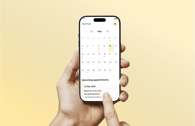
Every year lots of people are applying clinics for hair transplantition. Turkiye, in that sense, is a highly popular option. Wheather patients travel to another country, or in their country; we know that the post-transplant process can be full of questions, doubts, and “Is this normal?” moments. That’s why HairTrack is created, an easy-to-use app that guides you through every step of your recovery.
Why are patients having hard time?
I interviewed a patient who had undergone a hair transplant. Their experience helped me identify key pain points.Here is what stood out:
👉 Patients often lack clear instructions for basic tasks (e.g., when and how to wash their hair)
👉 They cannot access to non-judgmental support
👉 Even after leaving the clinic, they still need follow-up and feedback.
📍 Problems spotted
01
❌ Uncertainty
Scattered or unclear information from unreliable sources
03
❌ No quick way to ask for help
Lack of 24/7 support or someone to ask simple questions
02
❌ No reminders
Patients often lose interest over time and miss self-care steps
Challenge
How we can keep the user active in the application through the entire treatment procedure?
⬇️⬇️⬇️
User Needs
🎤 The product should be communicative
It is stated that 44% of hair transplant patients were following the medication advice given by their hair transplant surgeon. This values the importance of keeping the communication with doctors and health workers.
Source here
😌 The product should be trackable
Users are in need of monitoring constantly. Tracking their medications and growth of hair will help them to do their responsibilities even if they left the country already. It is aimed in the application to notify users and remind them their daily or weekly responsibilities.
🤝 The product should be trustable
Clients have concerns over having a procedure abroad, especially they never have left their country before. In this situation, clinics are supposed to give as much information as they can.
😌 The product should be satisfying
One of the most common complaints by patients is dissatisfaction. This either could be because of medical error or lack of communication with the doctors. Communication with a professional would definitely relieve their stress over procedure.
Source here
📍 So solution is...
🤝 Building trust
Clear and trusted information from a single source
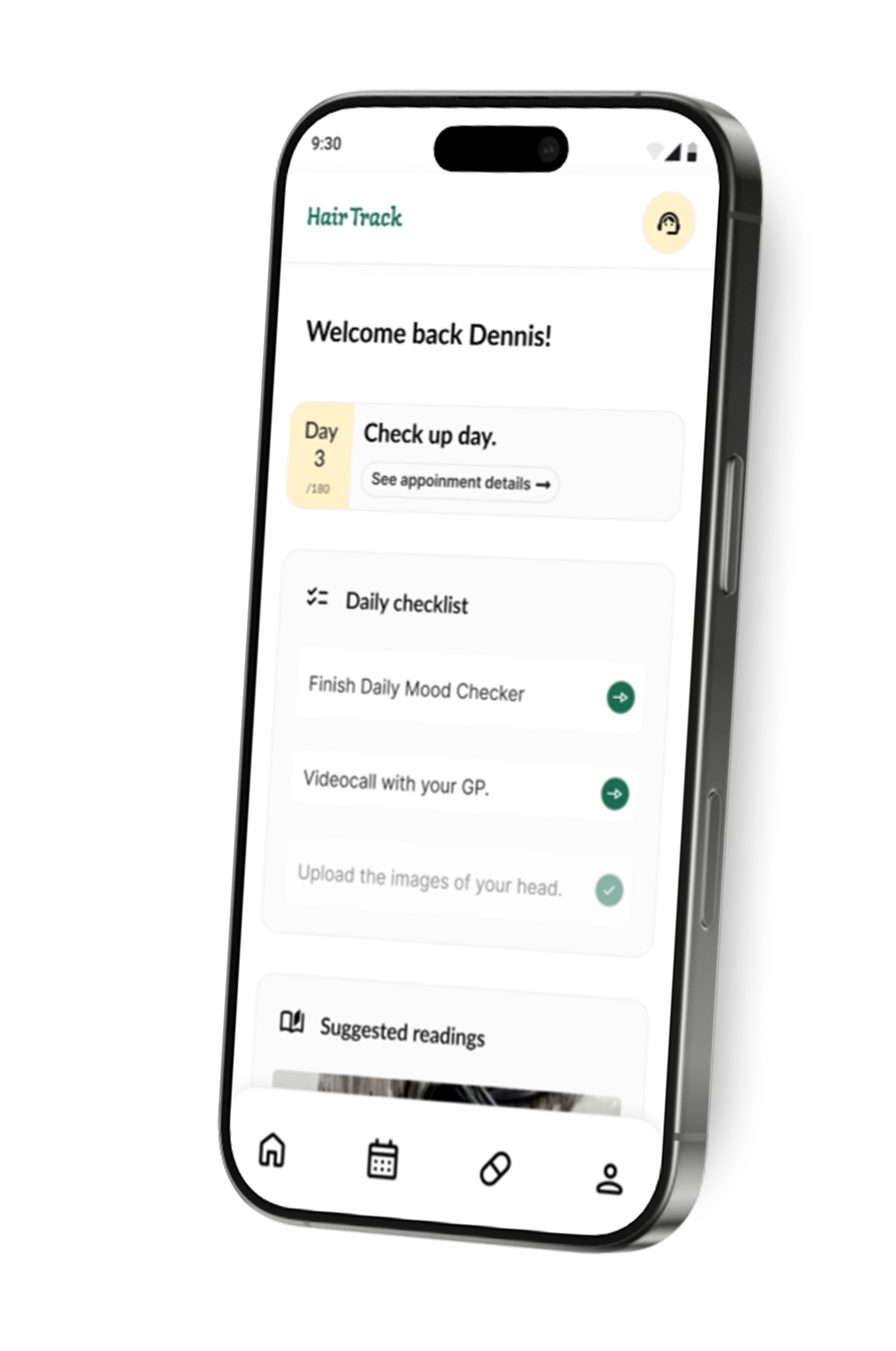
🤖 AI-Powered chat
AI Assistant available 24/7 for common questions
📅 Clear recovery guidance
Step-by-step guidance throughout the healing process
🔔 Keeping on track
Smart reminders and progress tracking to keep motivation high
Design Solution
Hair transplant journey doesn’t end at the clinic door and neither should their support.
00. Userflow
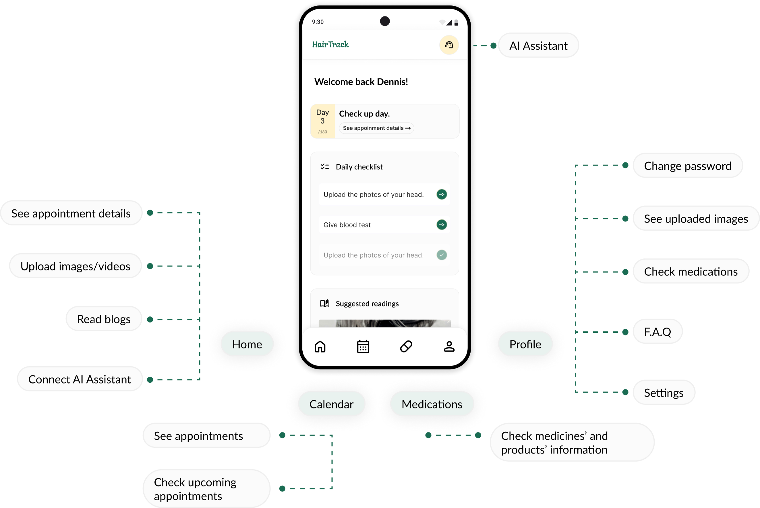
01. Building Trust
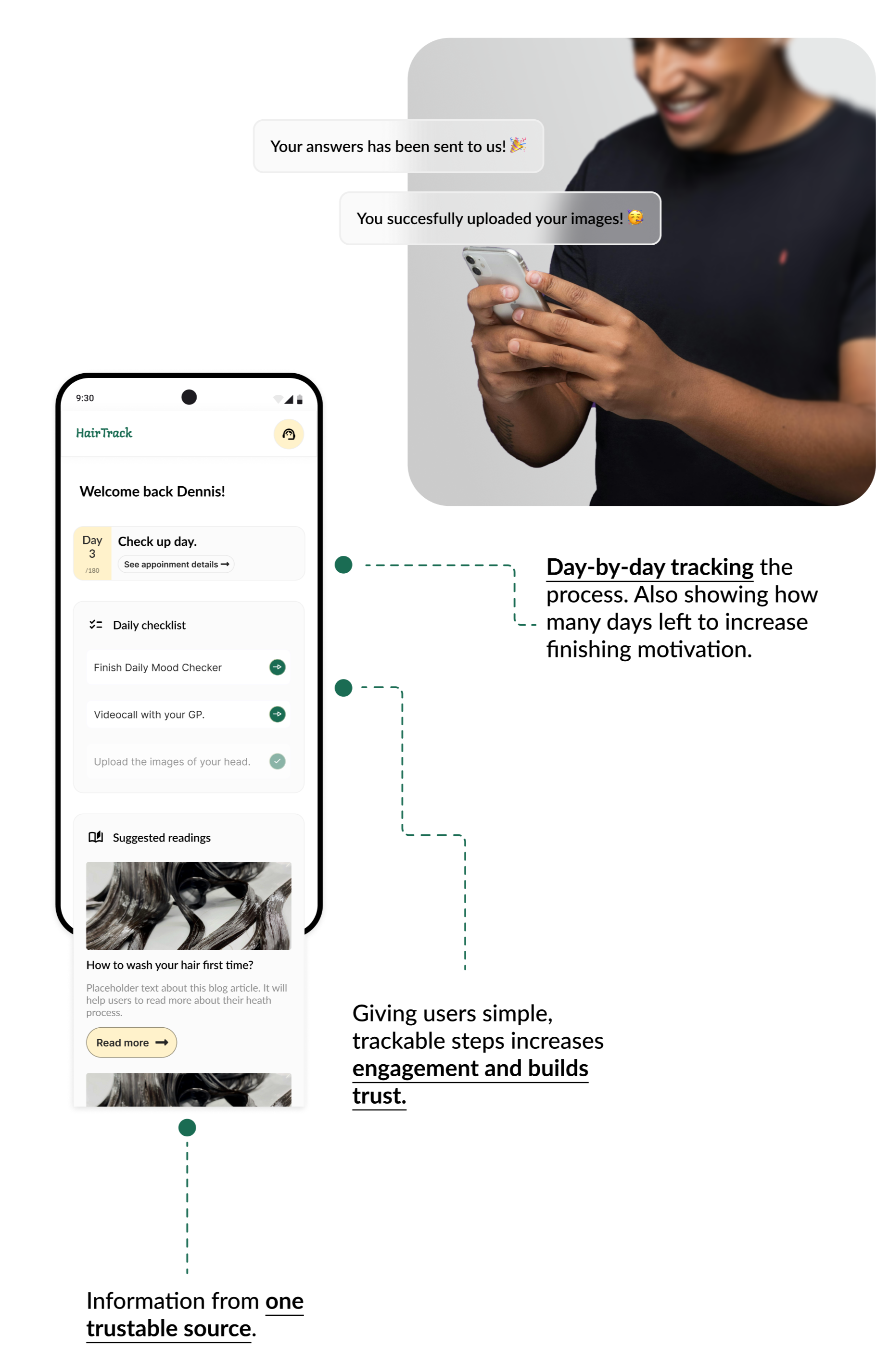
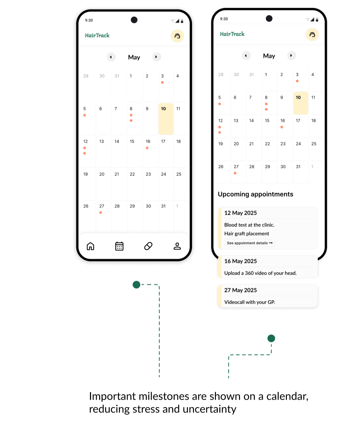
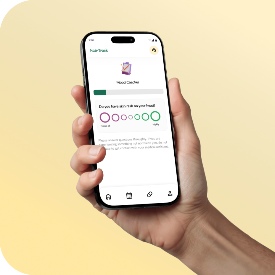
03. Clear recovery guidance
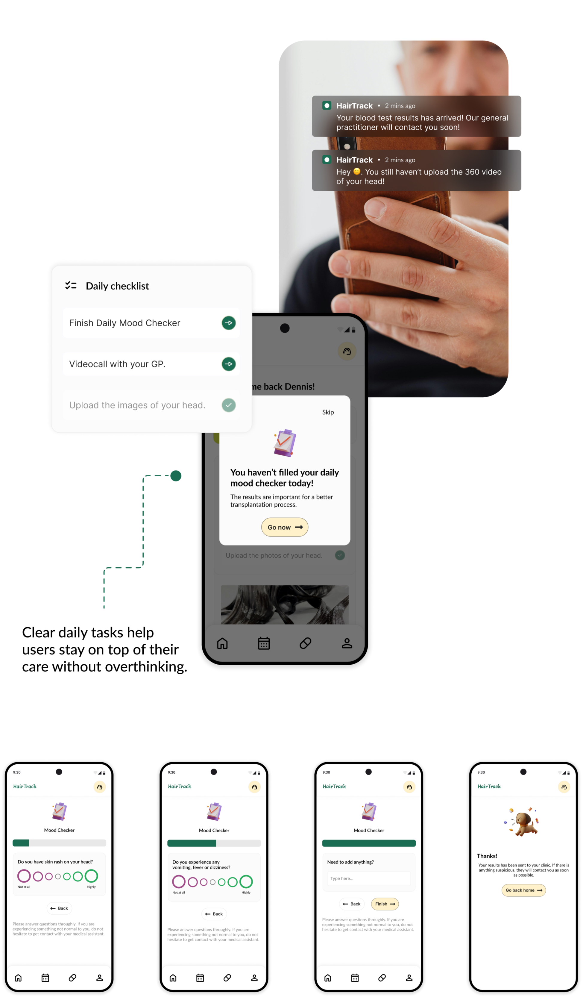
03. Clear recovery guidance
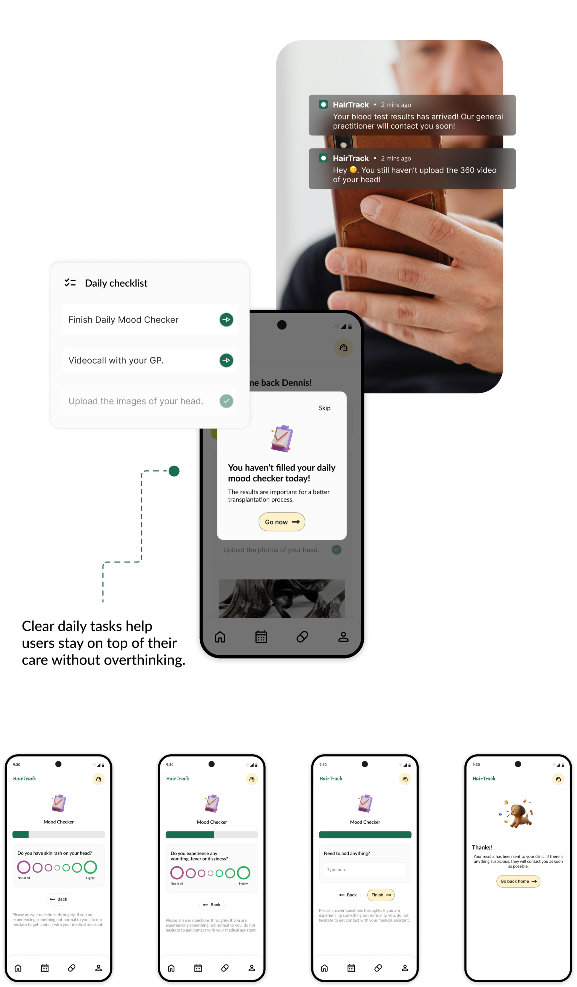
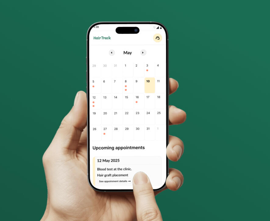
04. Keeping on track
Conclusion
HairTrack brings lots of potential to the healtcare field. With its improved user engagement and user-friendly solutions, it can be a great tool for businesses who are working in health and software fields.
Enabling shared payment
Shared Payments is a feature designed for a banking application that allows groups of people, roommates, business partners, or anyone who splits costs to manage and pay shared bills together, directly from their bank. The goal was to take a process that today lives across WhatsApp messages, mental math, and awkward reminders, and turn it into a single, transparent, in-app flow.Role: UI/UX Designer & Researcher
Scope: End-to-end flow, starting from create a group to completing the payment
Used tools: Figma, Miro
For the context
Splitting bills is one of those everyday financial tasks that almost everyone has experienced, yet very few tools handle gracefully.
Traditional banking apps are built around the individual by having a single account, a single balance, a single transaction history. They aren't designed for money that belongs, conceptually, to more than one person at once. Users having hard time when it comes to paying the bills and waiting for everyone to pay their own share. Spreadsheets, chat threads, or simply trusting people to pay them back eventually creates excessive cognitive load.
This project set out to bring that shared financial responsibility natively into the banking experience.
Why are users having hard time?
Through the lens of common bill-splitting scenarios, three core pain points stood out:
👉 Someone has to pay the full bill amount and then chase everyone else for their share which turning a routine payment into a recurring, uncomfortable social transaction.
👉 Group members don't have a clear, common view of what's owed, who has paid, and who hasn't.
👉 Requesting money is left to informal channels (texts, verbal reminders), which is inefficient and often socially awkward, especially for recurring bills like rent or utilities.
Challenge
How might we let a group of people manage, track, and pay a shared bill together with full transparency and minimal manual effort?
⬇️⬇️⬇️
User Needs
😰 Remove the awkwardness of asking for money.
Replace manual reminders with a system that tracks and requests payments automatically.
👀 Make shared status visible at a glance.
Every member should be able to see who owes what, and who has already paid, without asking.
💕 Keep the flow familiar.
The flow should be resemble to other cost-sharing apps. However should also reuse patterns already known from everyday banking (payments, invoices, contacts) so the feature feels native.
😌 The product should be trustable
The group details should be managed, edited and/or removed easily. Flexibility must be one of the core features of the design.
📍 Design Solution
00. Userflow
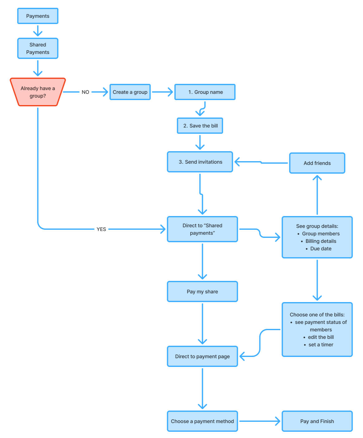
01. Wireframe
I mapped the entire shared payments journey in low-fidelity wireframes. I only kept the most core features of the journey, such as, group creation, inviting members and splitting a bill by equal or percentage shares and confirming payment. This stage let me test the logic of the flow before committing to visual design. It also helped validate that core actions such as paying, reviewing shares, and tracking status.

02. Group Creation
If no group exists yet, the user is guided through a short, three-step setup, shown clearly with a step indicator (1–2–3) at the top of every screen so users always know where they are in the process:
1. Name the group: The user types the shared expense a recognizable identity (e.g., "Home," "Office").2. Add a bill: The user selects a bill category (phone, internet, water, electricity) and then the specific provider (e.g., Türk Telekom, Vodafone), pulling in the invoice amount directly rather than requiring manual entry.3. Invite members: a unique group code is generated and can be shared instantly.
03. Group Management
Once a group exists, returning users skip setup entirely and land directly on their shared payments dashboard. From here they can:
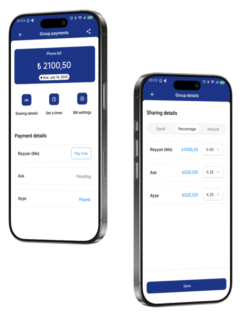
1. See shared payment groups: Users may belong to different groups, like "Home" or "Office." Keeping these groups separate is important, so people don't mix up bills from different parts of their life.2. Group payments:: To reduce cognitive load, the app shows the due date, offers a reminder option, and displays each member's payment status (pending/paid) at a glance.3. Manage expense details: Users can split a bill by percentage, ratio, or fixed amount. This keeps the split fair and flexible. For example, a student who spends the summer at their parents' house might not need to pay the same share as other roommates.
04. Payment
Apart from other apps, this flow offers users to pay single or many expense all at once.
1. Single payment (left): reviewing group and invoice details first, then proceeding to select a payment method and confirm.2. Fast payment (right): a fast path for users who just want to settle all of their share immediately and at all once.
Reflections & Learnings
Designing for shared money meant rethinking a lot of banking UI, which usually assumes a single account owner. Showing "who owes what" clearly, without making it feel awkward, was one of the trickiest parts of this project.
Reusing familiar payment and contact patterns from the core app made a brand-new feature feel easy to learn. Good design is about combining known patterns in a new way.